Hello people. How is the Saturday morning treating you? This post was originally slated to get published last Saturday but I was down with a flu. For two days I felt like a patient napping through the day and surviving on hot soup, hot chocolates! I didn’t even open my laptop for a few days, but all that napping is making me crabby, so I guess I should be back at what I like to do – create wonderful things.
So what do we have for #SaturdayTutorials this week – *drumrolls *Your Custom Blog Logo – Shapes! Woot Woot. Are you excited? And there is a tiny contest and giveaway too at the end of the post. So wait for that.
Your blog is your brand, your blog is a part of you – your identity. It is always good to give identity to your blog as someone would give identity to a product. Human mind retains visual cues better and longer than just text. If it is me, I remember what I see more than what I hear or read. It is same for the identity of your blog.
Why do you Need a Logo?
Logo creates your image or brand identity – it represents you
Logo is one of the most powerful marketing tools for your blog – flaunt your logo in all your social media accounts
Logo enables you to claim ownership of your blog – when you and your blog (or service) is popular enough register your logo and get a Trade Mark.
Designing a Logo
There are many ‘logo-maker’ kind of sites out there where you can edit names and get your logo made for free. But none of them would be a custom made one. Which means two or more people can have the same graphic as their logo with may be some different text. Would you want that for your logo? Definitely NO.
Simple colors, simple fonts, simple elements goes a long way. What you need to ask yourself first is how you want your blog to be known? Are you a woman blogger who want the blog to look all girly? Are you a food blogger? Are you a photographer? Do you write only about blogging? Basically what is the niche and what comes to your mind first when you think of your blog?
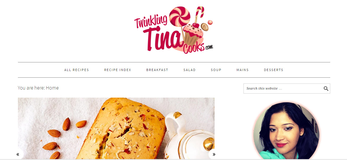
Twinkling Tina Cooks is my food blog and my logo is not what you will find in a regular food blog. No fork and spoon, no leaves and spices. It rather has cupcakes, candies, chocolates – in short for all things sweet. And in general I post tons of desserts.
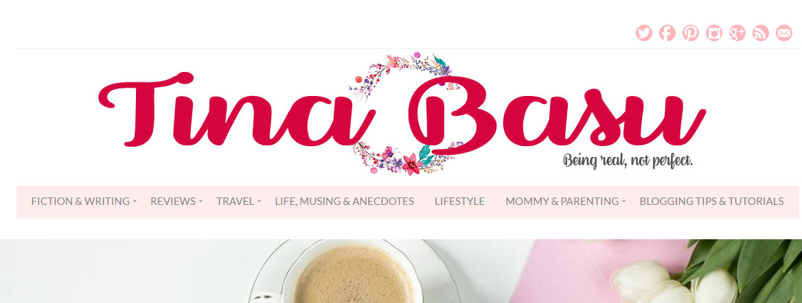
Whereas this one is a lifestyle blog and I write about a lot of things – I didn’t want too much complicated imagery nor did I want a regular label. That’s why I got a floral wreath – more on the olive wreath lines. [yeah ok, I crowned myself that!] But this one is more of a blog header and not the Logo. There is a difference between a logo and header and I’ll explain that in next week’s tutorial.
Types of Logo
There are a zillion ways of making a logo – text based logos, typography logos, illustrations, imagery, icons blah blah blah. You can’t understand everything in one day. It is an industry in itself. It is not just a design there’s a lot that goes behind it. And you can’t create everything using the free tools. But keeping all that aside we’ll design something easy yet nice that is perfect for your blog.
There’s going to be a series of tutorials on logo with text, illustrations (though the scope with free tools is very less), cliparts etc. So watch out for the #SaturdayTutorials on Twitter and Instagram.
Logo with Shape
Today I am going to make and share some simple shape logo using Picmonkey to give you an idea what all you can create.
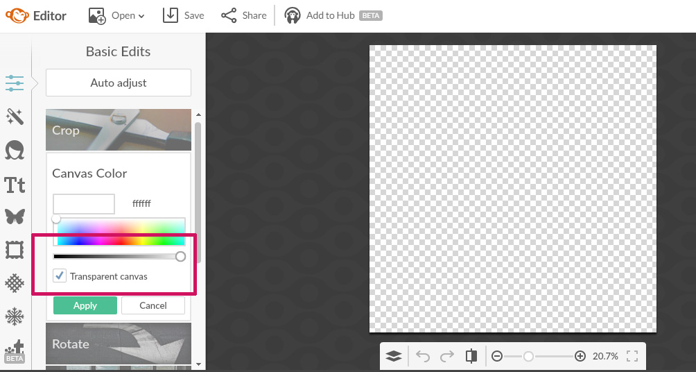
Open a 700 x 700 px canvas. Always work on transparent background while designing logo.
Click on Overlays and pick up shapes to design your logo.
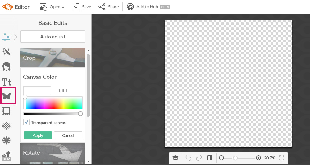
Under Overlays you will find loads of options of shapes, ribbons, pins, banners, arrows etc. Choose whatever shape you want for your logo.
Here are some examples that I made with shapes available under Overlays
Tina Says
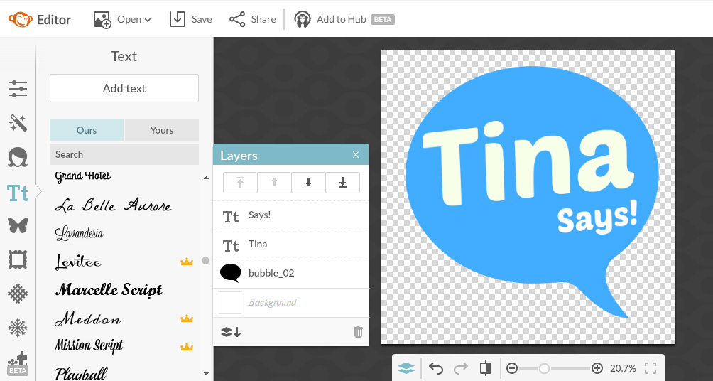
I made this simple call out logo Tina Says using a comic bubble and some texts. The best part of these free tools is there are many fonts to choose from and you can try out different things.
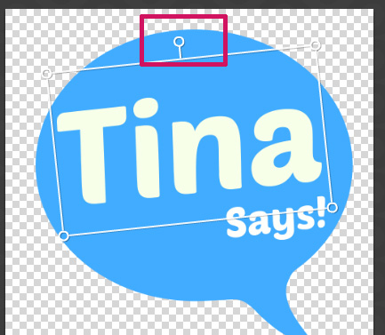
Use the central handle for rotating the elements (text/ shape)
Pro Tip – Choose one dominant color and one subdued color unless you want your logo to look like a rainbow!
Even if you like to play with a lot of colors avoid too many bold colors at one place – it’s like killing the eyes of the other person. Just to show you how color combinations can go wrong here is a n example.
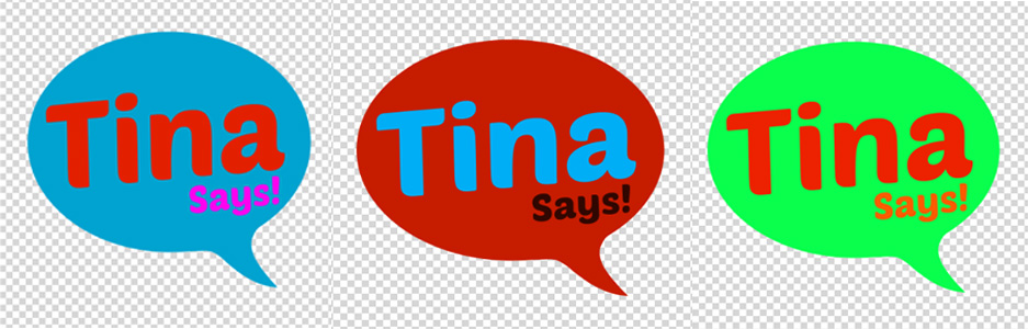
You might like Blue, red pink, yellow and loads of bright colors. But putting too much in one single logo can go horribly wrong even if they look bright.
The No-Nonsense Round Logo
A simple round logo can be clean yet chic. With subtle hues and clean fonts you can create something pretty like the one below.
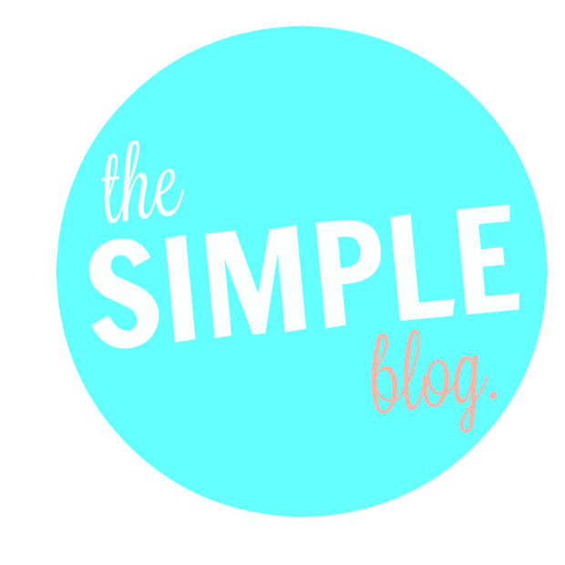
Pro Tip – Even if you like Script fonts and the fonts that looks like handwriting, calligraphy etc don’t over use them. Mix and match with bold sans serif fonts.
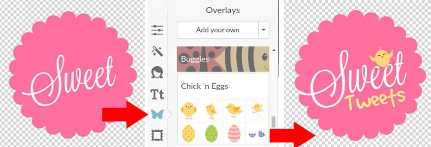
More than Two Overlays
When you start fidgeting with the overlays more you will find these tiny illustrations that are free to use in your artwork. That’s how I made a little tweeting logo.
Saving a Logo
The main reason to choose Picmonkey over Canva for designing a basic logo is the transparent canvas. This is required when you have to place your logo somewhere – letter head, PPT with different background. You don’t want a white patch behind the logo! Save the logo in .png format.
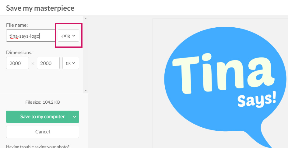
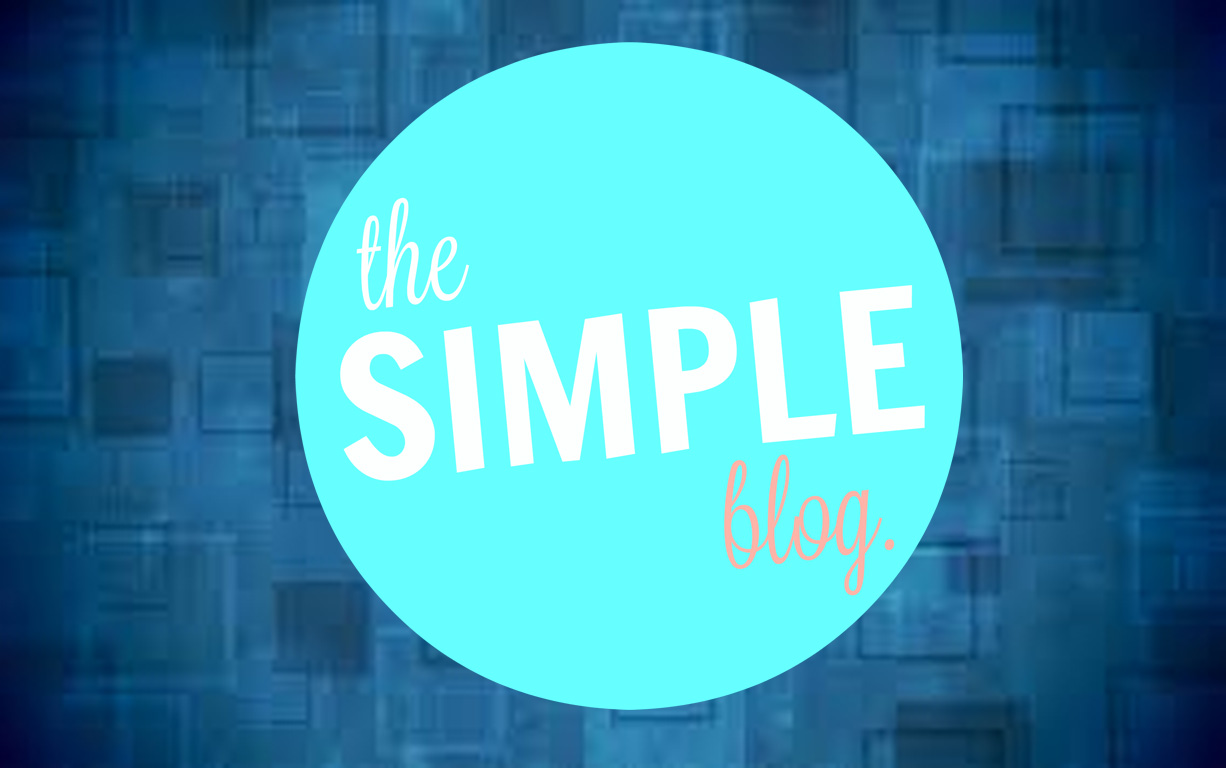
What this does is it makes you place the logo on a colored background easily without having to think about how to remove the white from behind.
Something like this.
Limitations of Free Tools
While the free tools are good for beginners because they are FREE –obviously and also anyone can use them. You don’t need to know any design skill – well almost. But for someone like me who has spent about seven years in the branding industry it is like using a Nokia 1100 against an iPhone. – okay don’t hate me for that analogy!
The free tools are pretty slow.
Picmonkey has made half the things as Royal which includes a membership. Though it has a 7 day free trial you need to put in your card details and you will be charged after the seven days. So you can’t use all the fonts or all the overlays or effects.
Even in Canva a lot of the shapes and images cost and is not totally free.
Afterthought
As an afterthought I think I am going to do my next series of Logo Designing Tutorials using Photoshop and Illustrator and have some freebies too. Good ideas for now.
Contest & Giveaway
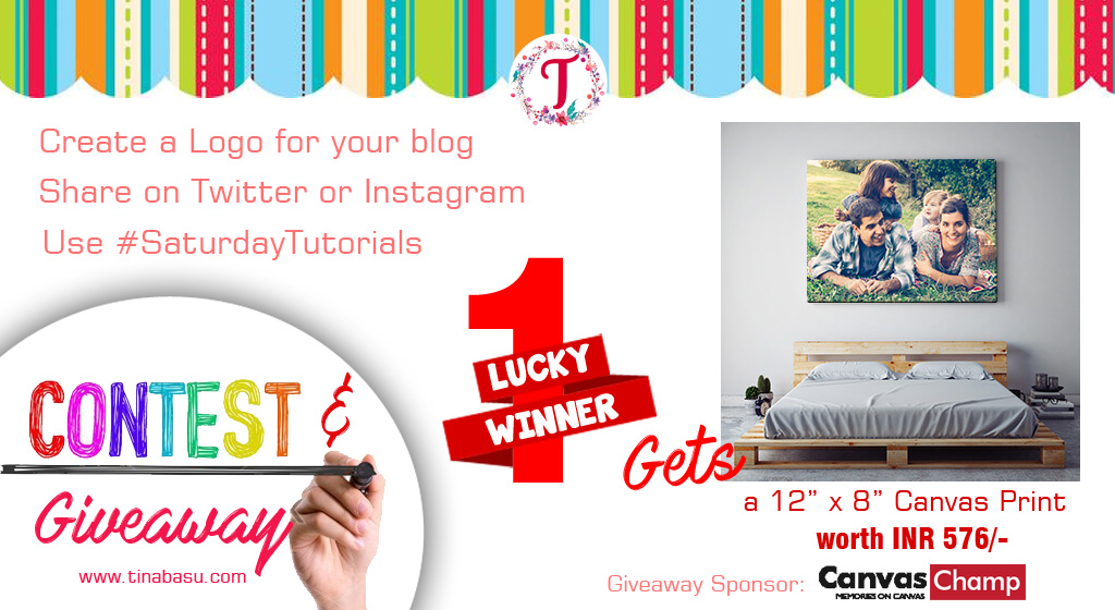
Now that you have learnt how to do a basic shape logo, create something nice and fun using a free tool and show me. I will select the one that I find the most attractive and the winner gets a 12” x 8” Canvas Print (worth INR 576/-) FREE courtesy Canvas Champ. We love everything chic. So why just get a photo printed when you can get a customized photo or your digital art printed on canvas! Excited!
Giveaway Rules
(1) Follow @canvaschampindia and @tinabasublog on Facebook
(2) Subscribe to my blog
(3) Post a comment on this post ( to confirm you have done 1 and 2)
(4) Post your designs on Twitter or Instagram tagging @twinklingtina & @CanvasChampIn
(5) Add the hashtag #SaturdayTutorials
(6) Contest closes on 30th Nov 2016. Extending the contest and giveaway till December 9 2016.
Will announce the winners Next Saturday. Excited???? Stay Tuned guys
Subscribe Here to get 5 FREE Logo Shapes. Add your text and you are done. They are already in .png format. How cool is that!
[convertkit form=4940765]




 Last week we had a fun prompt for #ThankfulThursdays about